

Sonoma West Medical Center Branding
February 29, 2016
In December 2014, Abra Marketing developed the branding for Sonoma West Medical Center in Sebastopol, California.
The Sonoma West Medical Center branding development was a particularly interesting project because it was part of the effort to reopen a closed hospital, something that is rarely successfully done.
The Sonoma West Medical Center rebranding presented an opportunity to connect to the extensive history of Palm Drive Hospital while communicating the new beginning that included important changes in the organization.
Rebranding can be an important part of taking a company in a new direction. And in this case, rebranding was a critical part of the strategy needed to overcome the enormous challenges of reopening a hospital.
Starting with the existing Palm Drive Hospital brand, we had the strengths of a long history and connection to many in the community. However, given the years of financial difficulties, there was a lot of negative connection as well. This included a great deal of opposition to reopening efforts.
For this reason it was important to connect to the positive past history but reinforce that the new effort was a fresh new approach being led by a new team.
The Sonoma West Medical Center logo is extremely well designed functionally, reproducing very well in limited colors and sizes.
Strategic Rebranding
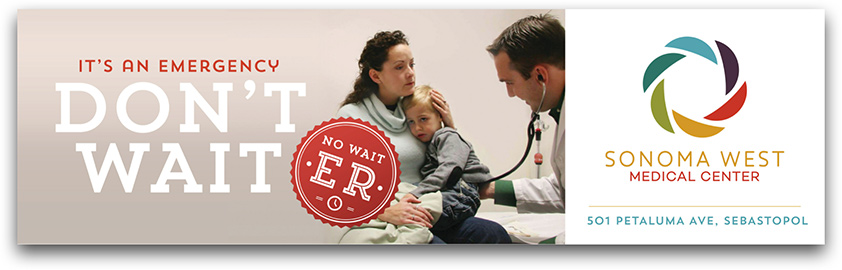
Symbolically we wanted the brand to present a new beginning. Leveraging the new name, our strategy was also to present the new entity as a regional Medical Center.
The former name “Palm Drive” literally isolated the brand to a specific street in Sebastopol – just one town served by the medical center. The new name Sonoma West Medical Center helped reinforce that the medical center served all of West Sonoma County (particularly important since many people in greater West County felt the hospital existed more to serve Sebastopol than them). This also opened the conversation about new services that would draw patients from greater Sonoma County and beyond, positioning the facility as a regional medical center. This was also a critical part of the new plan for financial viability. The branding we developed has a sophistication in the mark and the type which reinforced this positioning (note the font as shown here is the original concept; it was later changed by the client).
Logo Rebranding
The new logo also possesses a vibrance to communicate the new effort. The circular shape was chosen to reflect the diversity and agricultural nature of West Sonoma County.
Sonoma West Medical Center branding, a strong part in the Sonoma County medical community.
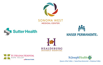
During our concept presentations we created a slide that showed our proposed Sonoma West Medical Center logo with logos from all the regional medical facilities. It definitely stood out as an equal player in the crowd.
Reopening A Hospital
Overall, the Sonoma West Medical Center rebranding captured the vibrance and renewed energy of the effort to reopen this hospital. The sophistication also presented the host of new programs that would elevate medical services to West and Greater Sonoma County while achieving financial viability.
The hospital successfully reopened on October 30, 2015.